“The main goal of a data visualization is its ability to visualize data, communicating information clearly and effectively. It doesn’t mean that data visualization needs to look boring to be functional or extremely sophisticated to look beautiful. To convey ideas effectively, both aesthetic form and functionality need to go hand in hand, providing insights into a rather sparse and complex data set by communicating its key aspects in a more intuitive way.”
–Vitaly Friedman “Data Visualizations and Infographics” (2008)
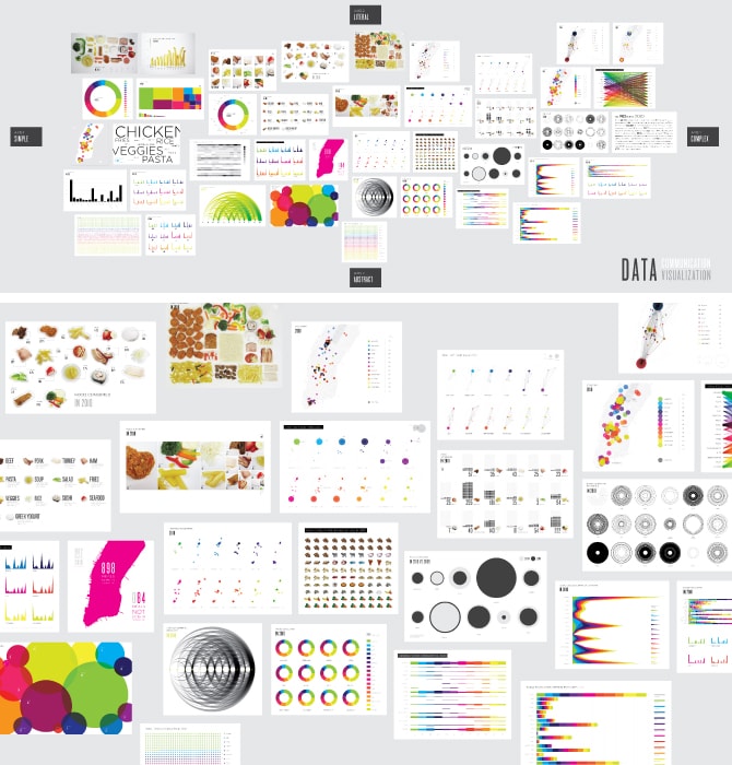
A year of meals visualized in more than forty ways by Lauren Manning.
The visualization of information tells us stories about how, what, and why things are happening. This information tells us what to do and how to do it, and even gives us clues about who we are and how we fit into the world. Information that is clearly presented shapes how we behave and directs future decisions.
At the same time, information can be overwhelming, confusing, and overbearing. Today, information flies at us at every moment of our lives. Molding it into something useful can be difficult. Yet, a visualization is more effective than a large, incomprehensible data set in that it sifts out what is pertinent and presents it in a legible form.
The art of distilling and translating masses of data into meaningful images requires precision and analysis. To begin the process of formally visualizing something, you have to know two things—your data and your audience. First, we mine the data to find a story—the trends, outliers, and aggregated correlations that explain what’s happening. Second, we have to figure out who we want to reach with this information. Learning about your audience—who they are, what questions they are asking, what information directs their decisions—influences how you illustrate the story.
There are many methods of visualization, four of which are particularly relevant to the fields of landscape, architecture, and urbanism: narrative, infographic, mapping, and diagrammatic. These methods work with many types of data and present multiple options for visual styling and clarification.
Narrative
Narrative visualizations tell a story with data. This mode of representation works best for data that is associated with time. With our reliance on words, this can be challenging to master visually, yet capturing these complex narratives reveals multiple layers of information.
For instance, narrative visualizations can be used to describe pedestrian traffic through a park over time, the frequency of tweets along the High Line during any given day, or to showcase occupancy and data trending of complex social and economic phenomena in public spaces. Narratives are often successful, but also the most challenging since every story is different and there is no consistent visual framework to use. Sometimes while designing these types of visuals, I find it helpful to bounce back and talk through the data. We are naturally more familiar with verbally describing stories and this exercise can help reveal implicit angles or outliers within the data.
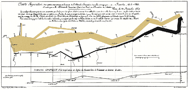
NAPOLEAN’S MARCH by Charles Joseph Minard (1869)
Napoleon’s March, by Charles Joseph Minard, is one of the most successful data visualizations of all time and is often referred to by Edward Tufte. It’s a must-see classic in the field of data visualization as it tells a gripping story. It simultaneously shows four variables—time, path, number of men, and temperature—in one concise map of Napoleon’s failed campaign of 1812 into Russia. Stripped of erroneous colors and jargon that can camouflage a message, Napoleon’s March uses color, size, and labeling strictly for illustrating these particular factors. Temperature and time are shown relative to points along the march. The march itself is depicted in two colors: tan for the journey to Russia and black for the trip back, with the thickness of the line indicating the size of the army—and its dramatic decrease due to punishingly cold weather. Usually, capturing four variables is too ambitious for one drawing, but here the data points are driven by the close relationship of these factors of the march to and from Russia.
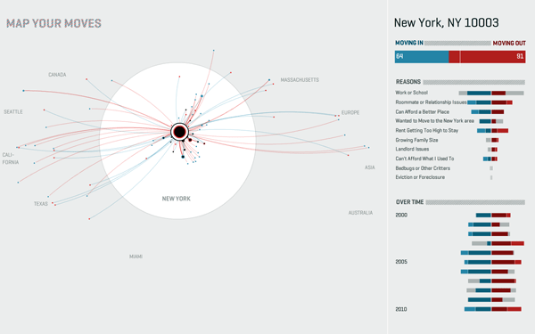
MAP YOUR MOVES by Moritz Stefaner
A second example of narrative storytelling lies in Moritz Stefaner’s imaging of the movements of residents into and out of New York City over the course of a decade. The interactive visualization “Map Your Moves” is an example of a narrative not based solely on space or time; rather, time is held constant (a decade), and geographic location is depicted through relationships rather than overlaid on a spatial map. Surveyed by the Brian Lehrer Show on the radio station WNYC, the story emerges through the moves of 1700 people in (blue) and out (red) of New York City, showing where they moved and why. By clicking on various bubbles, the viewer learns about the story gradually, through his or her own curiosity, rather than by trying to interpret all the information at once.
ONE HUNDRED MILLION CALLS by WIRED Magazine
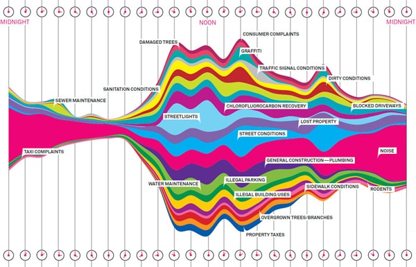 The third example of visual narrative is a flow diagram of over 34,000 calls to 311 in New York City made in one week. The data set in its raw form is unusable, but by isolating the variables by time of day (a twenty-four hour period) and aggregating the calls into twenty-two categories of complaints, the flow diagram shows how and when people complain—and what they are calling to complain about. By using a bright color palette and fun visual method, this data becomes a story that is understandable, interesting, and useful. Immediately, we see outliers in the data, such as noise complaints at night versus a more even distribution of complaints during the daytime. As with this example, flow diagrams are good for revealing overall peaks, as well as relationships between categories.
Infographics
Infographics use both conventional methods—like pie charts and bar charts—and abstract methods—like web diagrams and dot clusters. These visualizations tend to balance imagery and typography. The imagery can be photographs, illustrations, or, commonly, vector-based drawings. Infographics take very large sets of numbers, often formatted as cells and tables in a spreadsheet, and use hierarchy, layout, and context to focus on certain elements of the data. They can also illustrate a small set of data, and are a flexible option for presenting statistics and facts.
Context and hierarchy are two of the most important components of data visualization and are especially important in infographics. Context provides the viewer with a reference to something that they already understand so that they can apply it to new information. For instance, referring to the size of a golf ball, instead of 1.5 inches in diameter, quickly orients the unfamiliar to something familiar. Football fields, large animals, and even skyscrapers can be used to show one object’s size in relationship to another. Visual hierarchy gives more weight to some of the information than to others, helping that data stand out and be seen or understood more immediately. Some of the simplest ways to illustrate weight or significance are scale, color, boldness, and placement on the page.
VIRTUAL WATER by Timm Kekeritz
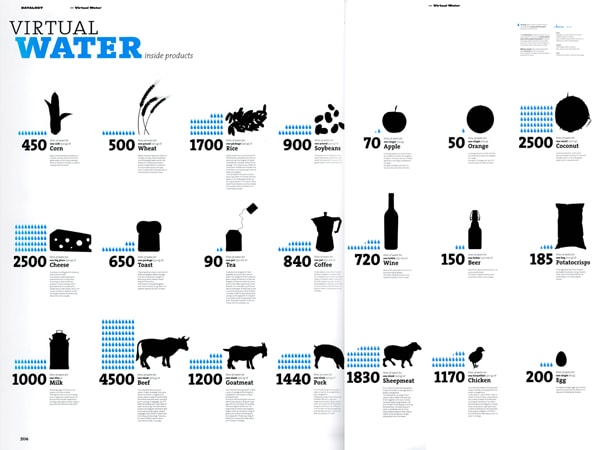 Virtual Water is an excellent example of how a message can be communicated clearly using a strong and simple infographic system. The color palette of cyan and black, along with vector silhouette imagery, focuses solely on the pertinent information: how much freshwater is used in the production chain of popular products. This visualization was so successful that while initially a single poster, it then became a full series, a website, and an app used to tell the story of water usage.
METROPOLITAN WORLD ATLAS by Joost Grootens
 A second example of a beautiful infographics is the book Metropolitan World Atlas which blends infographics with mapping. Throughout, Joost Gootens uses a strong pop of color, akin to an electric poppy, to call out data points on each page. Used alone or with city maps, bright dots scale to show relationships in data. The atlas covers a variety of information including population, crime, growth, density, and traffic. Rarely has such a simple visual and color system been able to work for such a large range of information. This style cannot work for everything, but when used successfully, proves highly effective and memorable.
Infographics can be used to describe phenomena and process in step-wise fashion; they can show relationships between scientific research and space-making; and they can be used to describe demographic breakdowns of particular cities and regions—although infographics are used in multiple other ways. Not all infographics are created equal, however, and can fail to communicate clearly. Be wary of mixing numbers with percentages, or comparing stats compiled by different sources. It is important to communicate the relationships within the data and to be clear about your message. A good rule of thumb is to try to tell one story at a time, and defer to simple means wherever possible. One of the biggest problems with infographics is trying to show too much information at once. Obvious hierarchy should be the first priority.
Mapping
Mapping is familiar to the fields of landscape, architecture and urbanism, but recent mapping has shown possibilities for growth, exploration, and improvement. Beyond marking locations, maps can be physical, digital, two-dimensional, three-dimensional, literal, abstract, black and white, colorful, and any number of other options. Mapping can seem overwhelming, often because users are trying to include a tremendous amount of information within a single drawing. Done well, it is one of the most powerful forms of visual representation. Maps inherently tell two stories—geographic location and plotted data. The most successful maps are systematic, logical patterns of data distribution that, in their aggregate, show relationships between data and space.
RACE AND ETHNICITY: NEW YORK by Eric Fischer (2010)
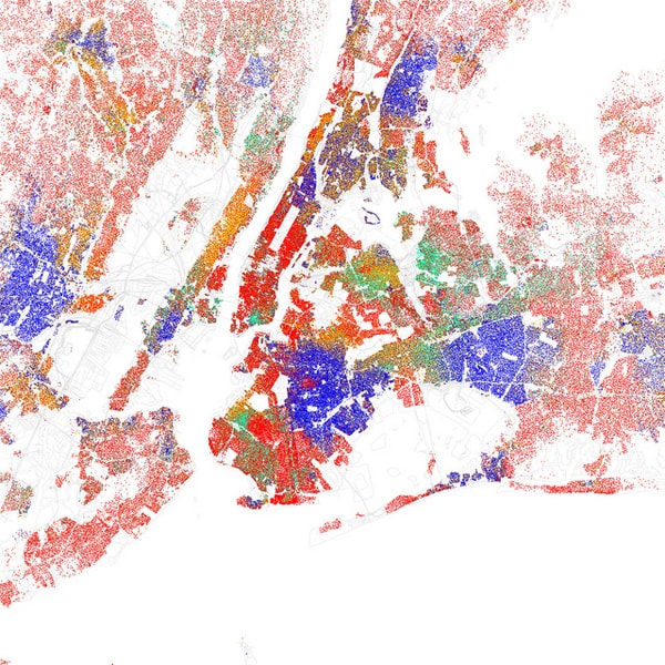 The 2010 mapping of Race and Ethnicity by Eric Fischer is a stunning visualization of the racial and ethnic divisions in major US cities. This data visualization takes a complex set of data and, through simple color coding and a consistent dot pattern, shows trends geographically. In the New York City example, the map shows White (red), Black (blue), Asian (green), Hispanic (orange) and Other (yellow). Each dot represents twenty-five residents. The distribution of racial populations is not uniform. Here, the data is start and geographic boundaries are reduced to thin grey lines. Stories surface within the image: Chinatown, for example, is a green cluster in downtown Manhattan; other neighborhoods show distinct and concentrated white and black populations, while parts of Queens are remarkably integrated.
NORTH SEA ATLAS by LUST
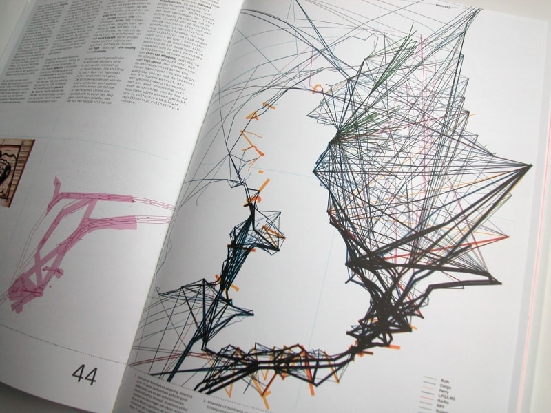 In the North Sea Atlas, the map by LUST reveals natural geography through data points. The team plotted the movements of the North Sea for twenty-four hours, with lines indicating the density and traffic of ship movement in and out of each port. Because of the density of traffic, the geography of the United Kingdom and the eastern side of Ireland becomes clearly delineated as if the landmasses themselves were included.
Diagrammatic
Diagrammatic representations visualize space in two- and three-dimensional form. Frequently used by architects and landscape architects to illustrate studies, process, and final rendering of building and landscape, successful diagrams are simple and tell one story at a time. Diagrams can be static or animated, and often contain layers of visual and typographic information. Often, a repeated set of diagrams will use the same framework, but highlight different information in each image so that the viewer can easily compare isolated sets of information.
LINCOLN PARK ZOO by Studio Gang
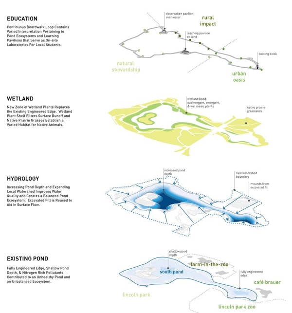 Lincoln Park Zoo by Studio Gang uses the simple outline of the zoo to distinguish the layers of program and design. This exploded axonometric diagram explains complex phenomena occurring within the same space. Instead of trying to show all the information on a single collapsed image, the separated layers make the information more digestible for the viewer. In this collection, the four diagrams indicate the zoo’s hydrology, wetlands, pond, and education pavilions so that one can begin to understand the reasoning behind the design. For instance, the proposal recommends excavating areas of the site in order to leverage water run-off so that water is filtered through the wetlands and before pooling in the pond.
VERTICAL VILLAGE by MVRDV (2011)
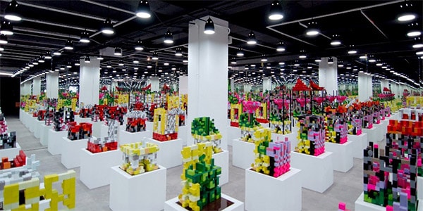 Diagrams are exceptionally useful in presenting ideas, conceptual frameworks, and spatial studies. As part of the Vertical Village exhibit in Taiwan, MVRDV explores vertical urban transformation and densification in East Asia through iterative diagrammatic modeling. These models show various configurations of programmatic elements typical of villages—living, farming, community space—within a single city block. This visual exploration is impressive: fun, informative, and stunning. It shows how far this visual method can be pushed and relies on the consistent use of color, scale, and material. Here, the power of this installation derives from the sheer volume and imagination of the designers’ manipulation of data.
Conclusion
Visual representation is a powerful and effective way to impart information. Each of these methods, in addition to others not described here, have a role in telling stories. Matching the data with the tool or technique is important. These frameworks can help make complicated or tedious information—research, data, facts, statistics, demographics, history, weather patterns, traffic, growth, and more—relevant and easy to understand. As with the race and ethnicity map, viewers may not know initially what a geo-located, color-coded data point means, but after looking at the map, they learn that a green dot in Manhattan’s Chinatown represents Asian occupants and the viewer can begin to get a sense of place and where and how this information fits together. The opportunities for communication skyrocket when lists and tables are curated into a visual story. And this is the ultimate goal of visual representation: to connect with an audience.
 Lauren Manning is a multi-disciplinary designer and is currently a member of the Data Visualization team at R/GA, a New York City based digital agency. As part of her graduate thesis, she explored over forty ways to visualize a single data set, bringing an iterative design method to the visualization field. In addition to data visualization, she works in design systems, branding, print, packaging, typography, and social media marketing. Lauren holds a master’s degree in communication design from Pratt Institute and a bachelor’s degree in architecture from Clemson University.
