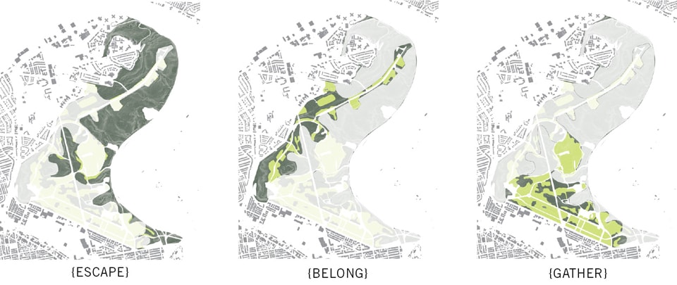
User behavior generating park design. Image by Michael Miller
Rating systems like LEED and the Sustainable Sites Initiative (SITES) reflect a recent interest in evaluating and predicting design performance. Both rating systems focus on environmental aspects of performance, and understandably so. But to form the basis of lasting urban interventions, projects must be socially, economically and environmentally sustainable. While SITES acknowledges sustainability’s three components, its rating system relegates social and economic concerns to one of five topic areas, undervaluing their importance. Moreover, social credits within SITES focus less on measures of actual performance than on a checklist of features expected to promote social equity, healthy lifestyles, and so forth. Evaluating projects before occupancy simplifies the task of rating projects, but misses the opportunity to examine actual rather than predicted performance. This essay will explore how we can measure social performance directly, and how integrating social research with the design process can produce more dynamic, responsive, and sustainable landscapes.
Social performance – or “human health and well being,” as SITES frames it – encompasses many issues: public participation, ADA access, construction wages, physical fitness, and mental health, to name a few.[1] Without diminishing the importance of these concerns, one element stands out as the essence of a landscape’s social performance: user experience. Much of landscape’s magic lies in the dialogue between people and place. Focusing on this interplay raises questions that matter deeply for our designs: Is it a landscape that people will like, or better yet, love? Is it the kind of place you find an excuse to wander down to on Saturday morning, that you bend your commute to pass through? Does it make your life more peaceful, more interesting, more joyful? As important as the full breadth of social concerns remain, I would argue that if a designed landscape does not offer a compelling experience, the landscape will be a failure. In a profession that contrives and conjures places for other people to enjoy, this question precedes most others.
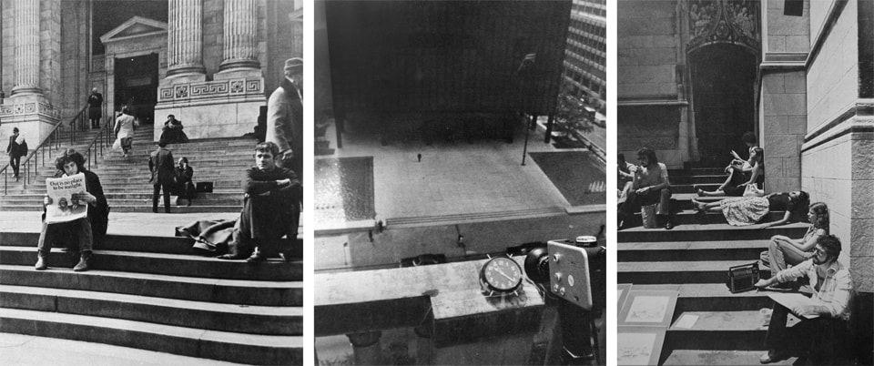
Images from William Whyte’s The Social Life of Small Urban Spaces:
The New York Public Library steps [left];
Whyte’s time-lapse photography equipment, [center];
Office workers demonstrate the importance of flexible seating, [right]
Popularity and Behavior
Even focusing on this one element of social performance, two complex and related questions remain: how can we measure user satisfaction, and how can we understand its causes? Popularity is the clearest indicator of success, often measured by the number of people that use a place. Popularity, or visitorship, is landscape architecture’s analogue to sales in product design or the number of hits in web design. Although mute on the subject of cause, visitorship is a convenient proxy for the many reasons that people might choose to visit a landscape.
Of the many landscape types, urban plazas are the most studied, thanks in large part to the work of William Whyte. In the late 1960’s, Whyte began applying direct observation techniques from the social sciences to the study of urban spaces. Through field observation, film, and time-lapse photography, Whyte provided the foundation for our current understanding of human behavior in public spaces. His work identifies physical elements that tend to produce success, such as a variety of seating and its proximity to busy paths, elements that may not, like proportion, and the famous finding that “what attracts people most, it would appear, is other people.”[2]
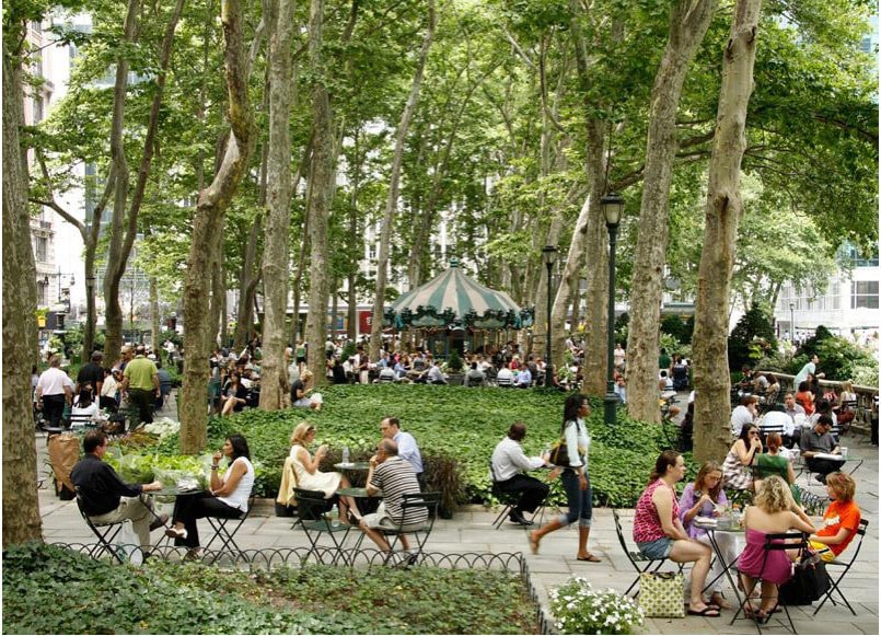
Despite Bryant Park’s position as a rare patch of park amid the extreme density of midtown Manhattan, [left], Bryant Park had, by the late 1970’s, become a catalog of vices, [right]
If Whyte’s research is the classic work on public landscapes, then Bryant Park is the canonical case study for its application to design. In 1979, the newly formed Bryant Park Restoration Corporation (BPRC) commissioned Whyte to study a park that was then dominated by “dope dealers” and “undesirables.”[3] According to Whyte, the undesirables were an effect, not a cause, of under-use. “The nub of the matter,” he wrote, “is access”—both “physical” and “psychological.”[4] Based on his earlier research, Whyte suggested simple but profound changes: removing the iron fence and shrubs that impeded views in and out, creating more frequent entries from the street, and piercing the internal balustrade.[5] He also encouraged the BPRC’s efforts to step up programming, improve maintenance, and increase security, while arguing that these moves needed to be paired with structural, physical changes.[6]
Three years later, the BPRC hired Hanna/Olin to design a physical restoration of the park. Laurie Olin synthesized Whyte’s analysis, a close reading of the site, and historical precedent into a subtle redesign that made few formal changes but radically improved the park’s social performance. The park’s now-iconic café chairs illustrate this synthesis: although Whyte advocates moveable chairs in the Social Life of Urban Spaces, his report on Bryant Park makes no mention. Olin’s idea for the chairs and a more open, transparent space beneath the framing London planes was inspired not only by Whyte’s research, but also the French gardens on which Bryant Park’s 1934 design was modeled.[7]
Bryant Park after establishment of the Bryant Park Corporation and a successful design intervention by Hanna/Olin.
The interventions worked: the result was a dramatic increase in the number of visitors and a park that drew both popular and critical praise. That the project was an intervention in an existing park proved a significant aid to integrating research. Although Hanna/Olin and the BPRC had to overcome the park’s nasty reputation, they were able to study the park, create a social model informed by Whyte’s broader research on public spaces in Manhattan, and then propose targeted changes. They were even able to prototype some of their interventions: before the full redesign, the BPRC tested programming ideas with a schedule of events and temporary kiosks selling food, books, and Broadway tickets. After initial success, they continued with a more permanent, ambitious agenda for design and management. The temporary actions alone doubled attendance, and today Bryant Park boasts 4.2 million annual visitors.[8]
Bryant Park offers a compelling model, yet every site has a different context. The park is now wildly popular, but on an average day, 188,000 people live in, work in, or visit the two-block radius surrounding Bryant Park.[9] From this perspective, its initial abandonment and disrepute is more shocking than its current success, an index of how far New York had fallen in the 1970’s. Were on-site changes solely responsible for its turnaround, or did the park benefit from larger urban trends, both in midtown Manhattan and nationally? Between 1990 and 2001, crime in the surrounding police precinct had declined by two thirds: which was the cause and which the effect?[10] Parks can be agents, victims, or beneficiaries of urban change. For designers to learn from a park’s success or failure, it is critical to begin parsing these causes. Such a study of Bryant Park might well reveal that a synergy between multiple forces—design, programming, management, and urban context—led to Bryant’s dramatic success. Post-occupancy evaluations of any park should place discussions of popularity and visitorship within this larger context.
Image courtesy OLIN
Understanding Popularity: Large Parks and Qualitative Research
Popularity metrics are appealing because they can neatly and quantitatively capture a range of behavioral cause and effect—from prosaic physical parameters like the frequency of park entrances to the ineffable experience of awe or wonder. These metrics avoid the rote checklist of features that may or may not result in a place that people love. With visitorship, you don’t need to understand what people are feeling; you just know they’re feeling something that draws them there. That’s the strength of this approach, and also the weakness: popularity may be easy to measure, but hard to act on when the motivations remain hidden.
In the case of Whyte and Bryant Park, an explanation was supplied by Whyte’s extensive and rigorous observation of similar spaces in similar contexts. Large parks present a different and difficult case. For example, is it always true that people seek other people, as Whyte found in Manhattan’s plazas? Large park users may be in search of different but equally potent experiences like quiet and solitude. This tension between popularity as the yardstick of success and the allure of the empty landscape is illustrated perfectly by Philadelphia’s West Fairmount Park.
Since moving to Philadelphia five years ago, I’ve been visiting and puzzling over this large park. It’s a thousand acres, bigger than Central Park but only one part of the core Fairmount Park system—about 3,000 acres of land along the Schuylkill River set aside for watershed protection in the nineteenth century. Despite initial ambitions to rival Central Park, West Fairmount Park was never designed as a coherent whole. Rather, West Park has been shaped by long intervals of benign neglect punctuated by moments of architectural and infrastructural intervention: the eighteenth century mansions that predate the public park; the 1876 world’s fair; a privately operated leisure trolley; a freeway that severed the upland park from the river below; and sporadic attempts to establish a cultural district of museums and performance venues.
Currently, the park is lightly used, lightly funded, and lightly maintained—at least by the city. Nonetheless, the park inspires a surprising degree of user engagement and maintenance, both formal and informal. In 2010, as part of graduate research at the University of Pennsylvania, I undertook a study to understand the patterns I had noticed casually as a park user, with the goal of exploring how user research could be integrated with large-scale design. Although the initial question, of why there was so much engagement among so few users, stemmed from a quantitative estimation of visitorship, answering the question required a deeper understanding of the complexity of people’s needs, motivations and responses. It required qualitative research.
To understand this qualitative dimension, I interviewed a range of users and non-users, casual visitors and committed stewards. The interview process began with direct observation to identify typical uses, followed by outreach through established organizations such as running clubs, friends groups, and educational non-profits operating in the park. Given the preponderance of organized users in West Park, this method was both appropriate and efficient—although it missed unorganized visitors. Interviews were conducted in a variety of formats, from phone interviews to participatory sessions where the interviewer accompanied users to the park. While the ease of phone interviews raised response rates, the participatory interviews were the most revealing: moving through the landscape provoked comments and questions that would not have been raised out of context.
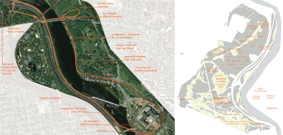
Participatory interviews proved to be one of the most useful research methods in the West Fairmount Park study. A group of runners unfamiliar with West Fairmount Park did not perceive the connection to a larger park system while running on the river drives, [left]. Even users who had been to the park multiple times tended to perceive it as a sparse constellation of attractions rather than a coherent landscape, [right].
In one series of interviews, I accompanied members of a running club on their typical routes and then on a first-time visit to West Park. These interviews suggested three key insights. First, it became clear that the runners would go to great lengths to follow a loop. One runner complained about her run’s first half, then praised the return leg. When I asked her why she didn’t follow the second half in both directions, she simply replied “because then it wouldn’t be a loop.” Second, it became clear that people did not perceive West Park as a connected whole. Runners on the river trail would be surprised by questions about what lay on the terrain just above – even if they had been there in a different context. Finally, the directional confusion and tangible nervousness of runners new to the park highlighted the impediment posed by its obscure and forbidding edges.
In early 2012, the figure of West Fairmount Park disappeared from Google Maps, [left]. Although accidental, this representation encapsulates many Philadelphians’ perception of the park: white space crossed by indifferent roads and sprinkled with sparse attractions. A few days later, Google restored the park’s official outline, [right].
Over the course of the interviews a consistent picture began to emerge: people who rarely used the park did not recognize it by name or as a cohesive place; it lacked identity. Most visitors did recognize and had often visited discrete architectural and programmatic attractions within the park, such as a museum and a performing arts center. When looking at or recalling other parts of the park, they found them confusing and sometimes scary. Frequent visitors, in contrast, returned for three types of experience that mapped spatially onto three distinct topographies. In the park’s steep and densely wooded ravines, people spoke of escaping from the city. On a long ridge punctuated by open fields and scattered buildings, users often belonged to a group with a specifically defined turf, sometimes assiduously maintained. The park’s wide, open plateaus drew the broadest population of users for events large and small, from barbecues and family reunions to circus performances and summer concerts.
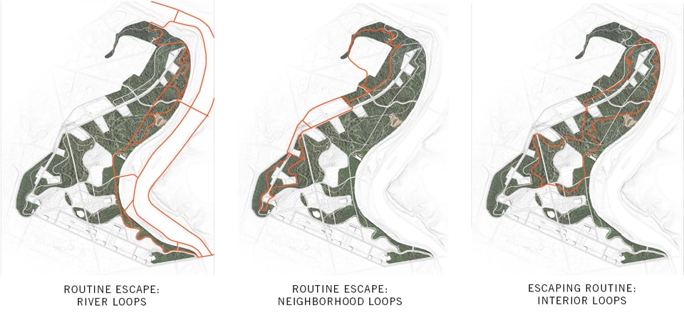
This understanding of how the park currently operates can provide a platform for design proposals. New design interventions might seek to increase attendance by improving the park’s spatial legibility and emphasizing the powerful experiences of escape, belonging, and gathering for new visitors—so long as they do not threaten the deep but sometimes informal stewardship of current users. A research-based understanding also provides a clear benchmark for evaluating design interventions. And although the results of this research were both site- and context-specific, similar methods could be applied to understanding any existing site or adding experiential depth to a post-occupancy evaluation.
Reconfiguring West Fairmount Park’s trail network to accommodate user patterns, while engaging the adjacent neighborhoods currently isolated from the park, and the river drives that are currently Fairmount Park’s biggest draw.
Prototyping Landscape
Research will have limited impact on practice if it remains purely academic and external to the design process. Although landscape architects can learn much from the social sciences, we should also look to the applied design disciplines, like industrial and web design, for ways to integrate research. The common thread of design brings similar time constraints and a drive to turn research into action. Collecting data through interviews, for example, can be incredibly time consuming and large samples may not be possible in a fast-moving design process. In the industrial design literature, researchers often suggest seeking out a few extreme users rather than many ‘typical’ users.[11] Triangulating between the experience of first time visitors, avid users with specialized knowledge, and a few people at the extremes of age or ability—children, seniors, the disabled, competitive athletes—can provide a quick but rich basis for design.
Comparisons to product design are compelling but also frustrating for architects and landscape architects. Our ‘product’ is always custom, never mass-produced; our budgets are small and shrinking; our projects are large, long-lived, and difficult to prototype. But prototyping lies at the heart of iterative design research: it allows designers to test their work not just against an abstracted model but with increasingly realized versions of the thing itself.
So how does one prototype a landscape? It’s easier if you’re considering relatively minimal interventions—redesigning an existing park, say, rather than creating a plaza on a former parking lot. Such is the case in West Fairmount Park, with its long history of official neglect and user modification. Through its 200-year history it has remained unfinished and largely undesigned, permanently in flux, prototyping itself. My design ideas for the park involved emphasizing, tweaking, twisting, and extending the existing structure, as well as expanding the park’s tradition of user modification, which allows for adaptation to changing needs.
This all sounds good, and ties neatly into contemporary notions of process and indeterminacy, but even the most open-ended landscapes require a structure – and that structure may not be small or cheap. Jane Suri of IDEO draws a useful distinction between “appearance prototypes” that show what a product will look like and “experience prototypes” that may look different but seek to produce, quickly and on the cheap, the essence of the designed experience.[12] She also outlines three functions of prototypes: “understanding existing experiences, exploring design ideas, and communicating design concepts.”[13]
In landscape architecture, we often focus on appearance prototypes that communicate—and sell—our unbuilt design concepts. A broader approach that includes programming, event, and temporary installation allows for experience prototyping and user feedback in advance of expensive permanent construction. Bryant Park again provides an early example, with its temporary kiosks and events. Recently, more cities and design firms have begun to incorporate event and installation into design and planning projects, particularly in large parks or where major changes to infrastructure are at stake. For example, New York prototyped new bike lanes and road closures with temporary markings in order to gather traffic and ridership data. Similarly, West 8 in Toronto staged a brief shut-down of an expressway that its waterfront plan proposes to remove, curating a weekend-long bicycle festival on the elevated roadway. Brooklyn Bridge Park and Governor’s Island have both employed light and sometimes temporary infrastructure—pop-up parks, paths, loaner bikes, hammocks—to permit early use and visitorship before completion.
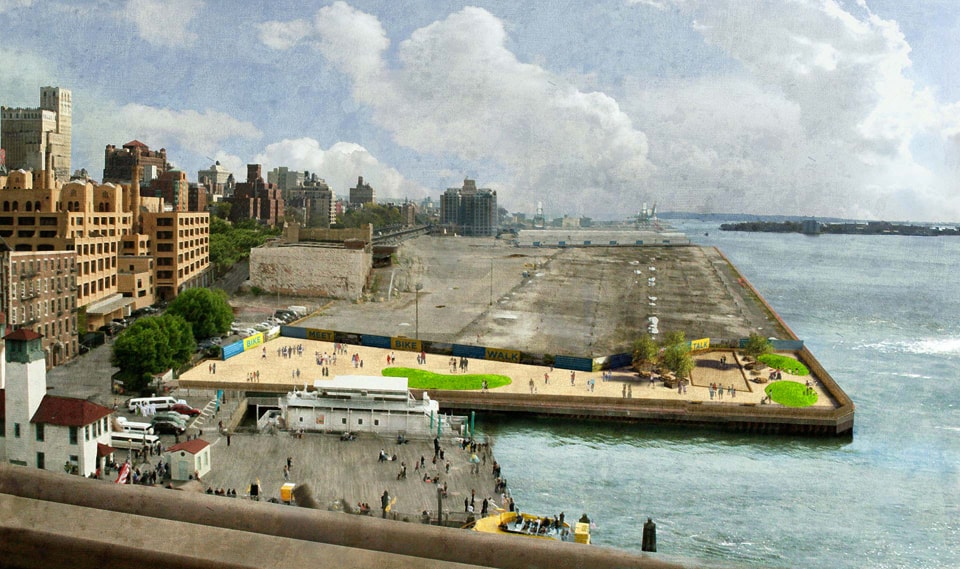 dlandstudio‘s 2008 Pop-Up Park at Pier 1, a temporary landscape prototype that drew user activity to the site of what would soon become Brooklyn Bridge Park
Often, though, these prototypes are conceived as demonstrations rather than tests; they should be both. If we treat them as experience prototypes providing crucial user feedback—as part of the design process, not just initial implementation—we can incorporate the lessons into more permanent versions of the design. By reframing temporary interventions this way, designers could offer park amenities sooner than if they wait for the full design to be completed and built. Making this flexibility clear to the public could also increase stakeholder buy-in.
What, then, should integrated research and design look like? In an ideal scenario, site-specific observation and interviews might help frame an agenda for design and establish criteria for success. Contextual research could identify potential users and larger urban forces influencing the site. Combining this project-specific research with a broader body of academic literature might give designers a working social model of the site and its context. They might then be able to make reasonable predictions about how their interventions might change the model and be able to quickly, intuitively evaluate early drawings. As ideas become more concrete, designers could test user responses to both appearance prototypes, like perspective renderings, and experience prototypes, like events and pop-up parks. They could then evaluate, rinse, and repeat, to produce iterations that perform increasingly well. This process might sound impossibly laborious at first, but by building up a body of knowledge over time, the application of user research can become more intuitive and less formal. When we project a multitude of happy parkgoers, or draw a path we like in plan but worry that it won’t satisfy desire lines, we are employing a social model—it just might not be based on research. And when we build a landscape, we are releasing a prototype into the world. Wouldn’t it be good to have done some beta testing?
 Michael Miller is a landscape designer and urbanist working in Philadelphia. He holds a Masters in Landscape Architecture and a Masters in City Planning from the University of Pennsylvania, where he has also taught. After working with the non-profit PennPraxis on Green2015, a plan for Philadelphia’s future park network, he moved across the Schuylkill to OLIN where he now works on research initiatives and designs for landscapes large and small.


